Revamp of Filecoin's Build Website for Improved Usability
Filecoin.io

View Case Study

YEAR
ROLE
Company
Individuals seeking healthy lifestyle changes need a better way to access Noom's science-backed resources because of existing UX and UI bugs that are standing in the way.
Through organic colors, intuitive user flows, and research-backed design decisions, the Noom redesign makes the awarded weight loss and health curriculum both accessible and able to stand out in a crowd of health apps.
Having previously used Noom, I’ve struggled to onboard properly to the program and wondered if other users faced the same challenges. I conducted informal interviews with 2 current Noom users and 2 potential users to achieve my interview goal of determining what Noom does successfully.
• 3 out of 4 interviewees had heard of Noom before
• 1 out of 4 interviewees is an active Noom user
• 2 out of 4 interviewees had previously used and unsubscribed from Noom
From the Noom website, I jotted down all of the brand experiences I gathered Noom wanted its users to experience. Words like scientific, natural, zen, happy, and empowering all popped up. Its current app experience doesn’t seem to match up with how the company would like to be portrayed.
It’s worth noting the app has a 4.7 star rating from 674k reviews. I read through ~50-100 reviews to figure out more about what real customers were saying. Most of them fell into specific themes, like general UX complaints, onboarding issues, and food log/tracking difficulty.
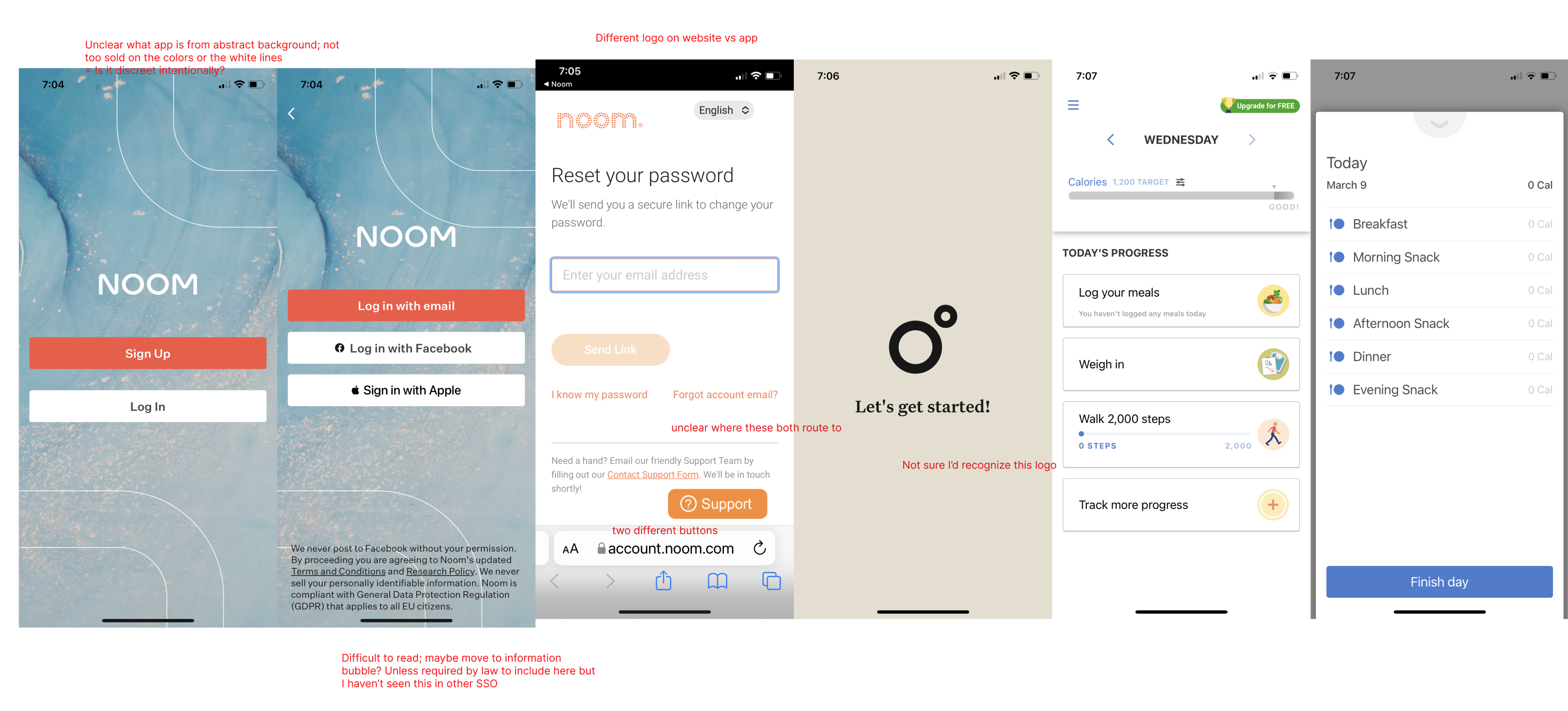
Users like the content that Noom provides but have difficulty finding it.
The app lacks a brand identity; it feels sterile and dated.
Noom in its current state is overwhelming for users.
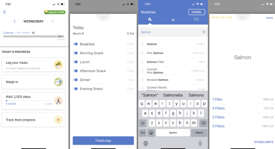
I tested three designs of the Daily Progress page with four participants:
- Completion rings
- Color coded completion
- Standard
All liked the idea of having some indicator showing what daily tasks were nearing completion or at risk, and three out of four preferred the "rings" concept (left). This carries over into my final design.

In my final mid-fidelity prototype, I included playful elements to better match the brand identity that Noom seems to be after.
Take a look for yourself, below or here.
It's easy to get lost in the details, especially when you feel like all of your content is important for users. This redesign challenged me to reconsider how I think about content and to reprioritize from a prospective other than my own.