Concept project for the redesign of the popular weight loss app, Noom
Noom


I was tasked with improving the usability of the Filecoin Build website, a platform where builders and potential builders access information on Filecoin, IPFS and how to get involved. Unfortunately, the website was causing confusion among users, especially software engineers who were the primary audience. My mission was clear: enhance usability and make it a breeze for users to find the information they were after. This case study takes you through my design process, including research, prototyping, and user testing.
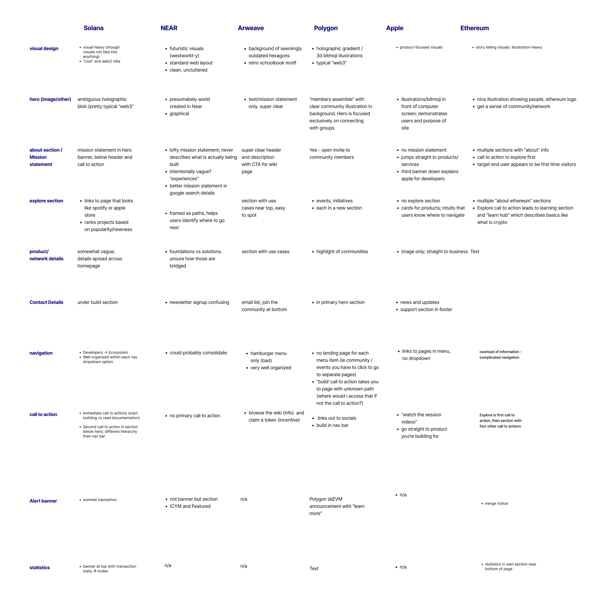
To kick things off, I embarked on an extensive research phase to get into the minds of the users. Through user testing of the existing website, I noticed that developers were quickly skipping over a lot of the featured information, hunting specifically for IPFS and Filecoin documentation. Another challenge was the "store" page, which users misunderstood as a place to buy cool swag rather than learning about data storage with Filecoin.
Armed with these insights, I got down to the nitty-gritty and interviewed 10 software engineers. I recruited participants through Twitter and tapped into those already familiar with the crypto space. With their valuable input, I built a prototype that I presented to the project lead, communications team, and product team for their thoughts. Incorporating their feedback, I then conducted more user testing to ensure the website was intuitive and easy to use.

I faced a couple of challenges during this design journey. First, it was all about balancing the needs of different user groups. The website had to cater to both developers and non-developers, delivering valuable information to both crowds. I had to make sure the website was accessible to users with varying levels of expertise while still providing the technical details that developers craved.
Another challenge was finding the right balance in communicating the benefits of IPFS and Filecoin without overwhelming users with an information overload. I had to walk a fine line, creating a user flow that showcased the essential information while effectively conveying Filecoin's key messages.
I delivered a user flow that hit the sweet spot, showcasing the desired information and aligning with Filecoin's goals. The website underwent a top-to-bottom redesign, boosting its intuitiveness and user-friendliness. Now users will be able to easily find the information they're searching for without reaching for the advil. The new design effectively communicates the benefits of IPFS and Filecoin without drowning users in technical jargon.
The new design received positive feedback from both users during user testing and stakeholders, with many praising its improved usability and user-friendly interface. My work contributed to an enhanced overall user experience, making it easier for developers and non-developers alike to access the information they needed.
The Filecoin Build website revamp is a shining example of the power of UX design in enhancing user experiences. Through extensive research, prototyping, and user testing, I crafted a website that effectively conveyed key messages while offering a delightful user interface. The result? A design that's intuitive and user-friendly, ensuring users can easily find the information they seek. The broader team is working on updating the site at large, so these changes are still waiting to be implemented. Still, you can explore my Figma file to get a feel of what it will look like!
See the designs in Figma or embedded below.