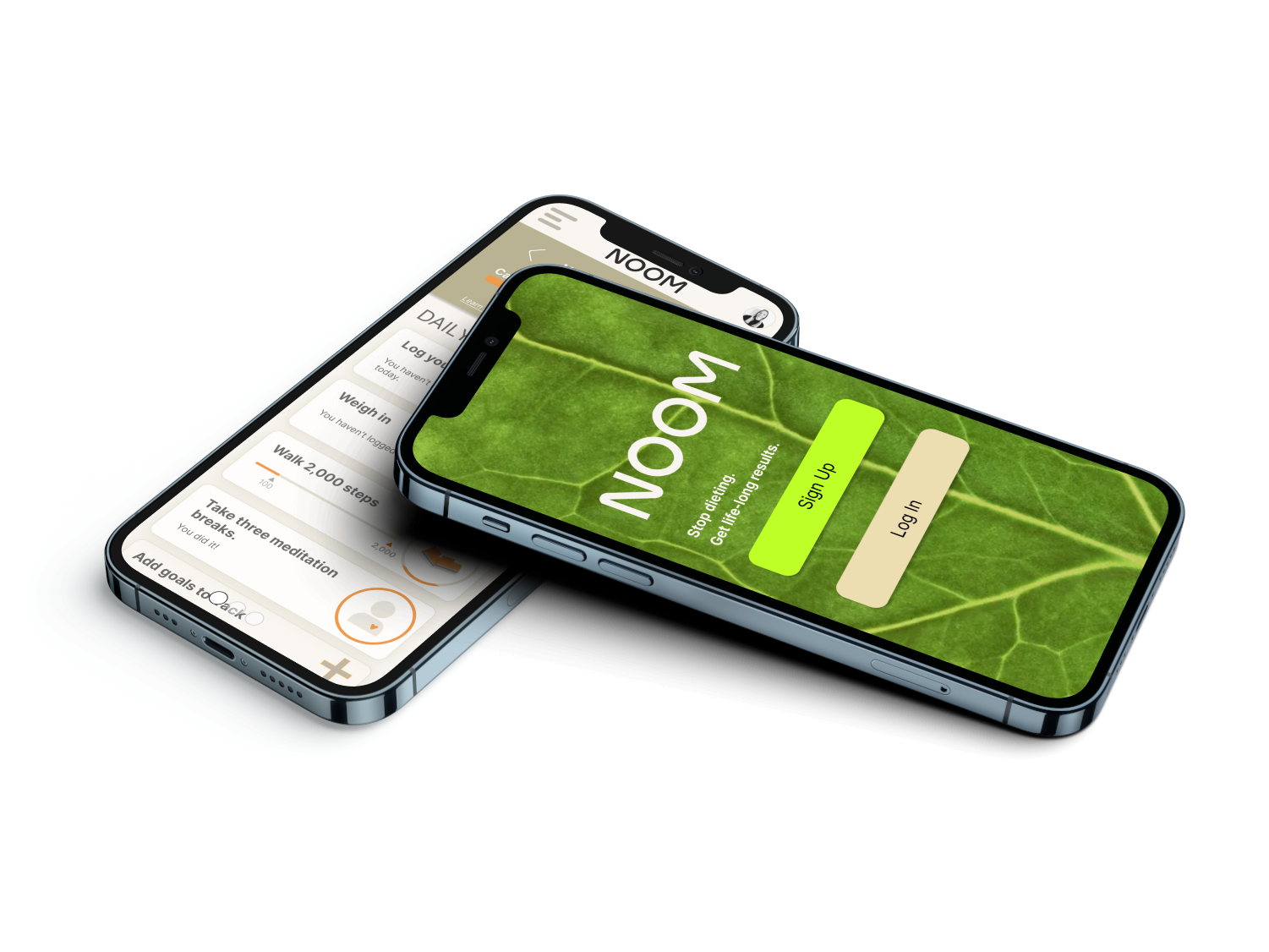
Concept project for the redesign of the popular weight loss app, Noom
Noom

View Case Study

YEAR
ROLE
Company
I collaborated on a project with the Protocol Labs Finance Team to create a landing page for Emissary, a website that would enable cryptocurrency payments. The objective was to design functional pages that embodied the Web3 aesthetic while providing a glimpse of the tool's potential. The team's ultimate aim was to make the service accessible to other teams beyond Protocol Labs. Cheers to open source! This case study explores my design process, challenges encountered, and the achieved outcome.
I began with comparative analysis and extensive research on the latest Web3 design trends, gaining a clear understanding of the design language and visual components synonymous with the Web3 aesthetic. Using this knowledge, I developed initial wireframes and prototypes that prioritized both visual appeal and user-friendliness.
Taking user feedback into account, I delivered three distinct versions of the landing pages, each featuring unique designs that reflected the PL aesthetic. Collaborating closely with the finance team, I delivered several design rounds, tweaked to specific feedback and user needs.
Once the design was chosen, I embarked on an iterative process, refining layout, typography, and color palette.
One of the main challenges was finding that sweet spot between form and function. The finance team wanted visually appealing designs that embodied the Web3 aesthetic, but we couldn't sacrifice usability. We needed to make sure the design was approachable and easy to understand.
Another challenge was striking the right balance in showing off the tool's potential without overwhelming users with too much information. Our landing pages had to effectively communicate the core features while still looking stunning and staying true to the brand.
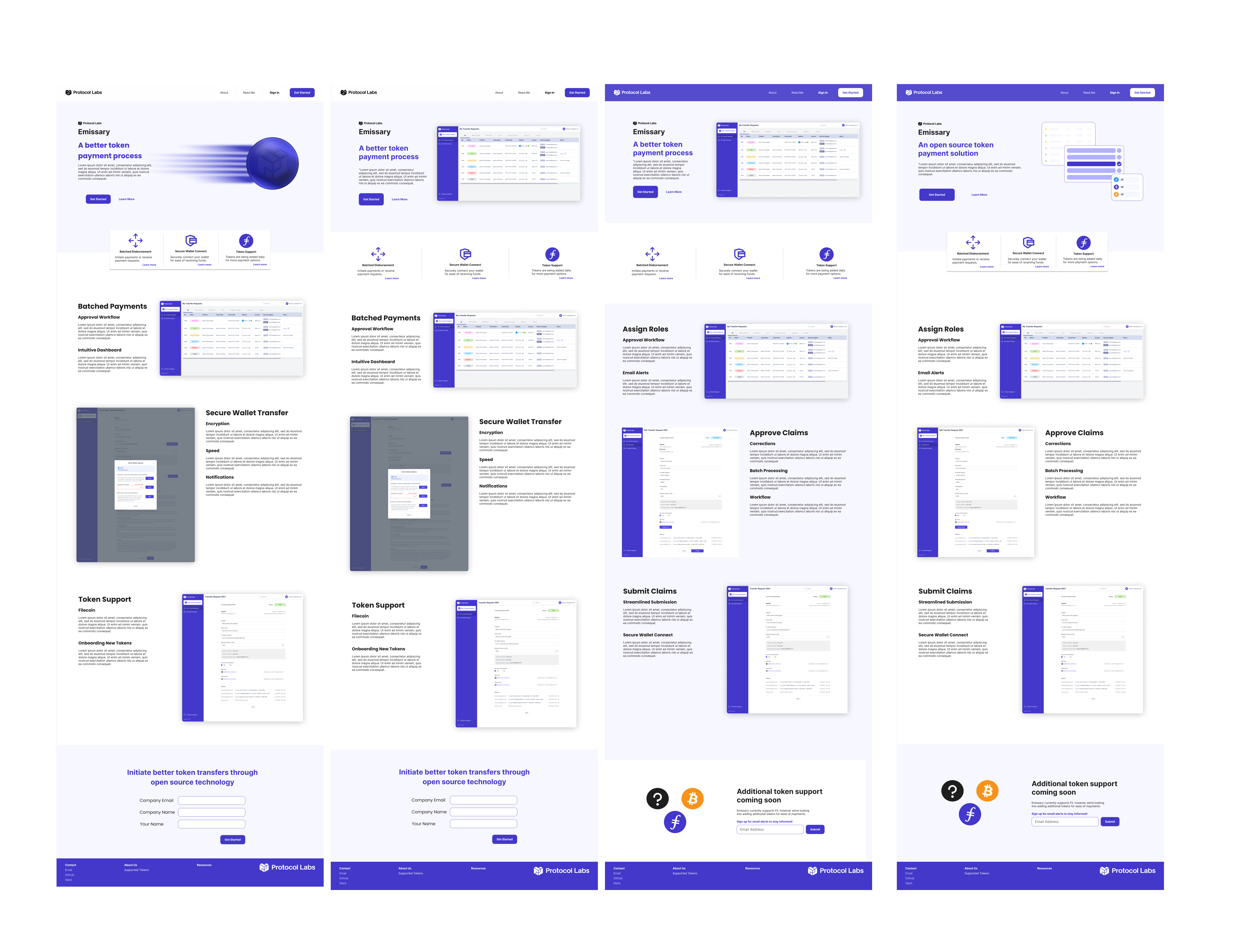
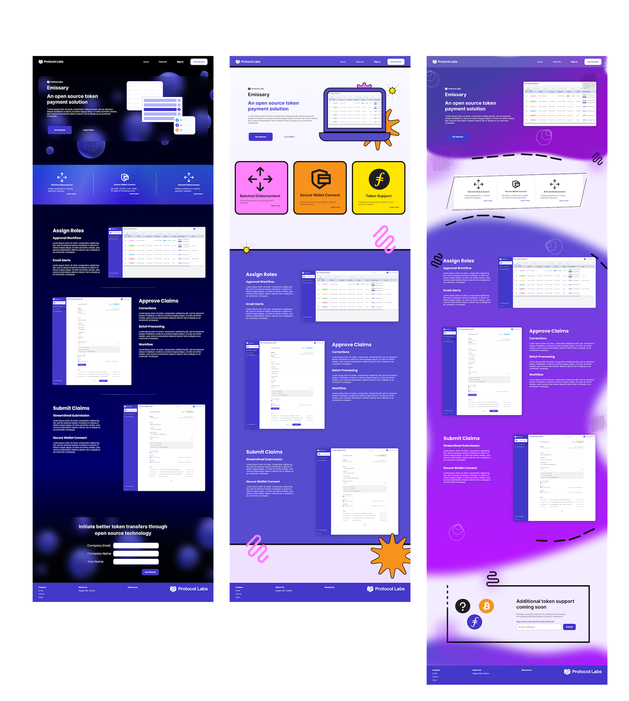
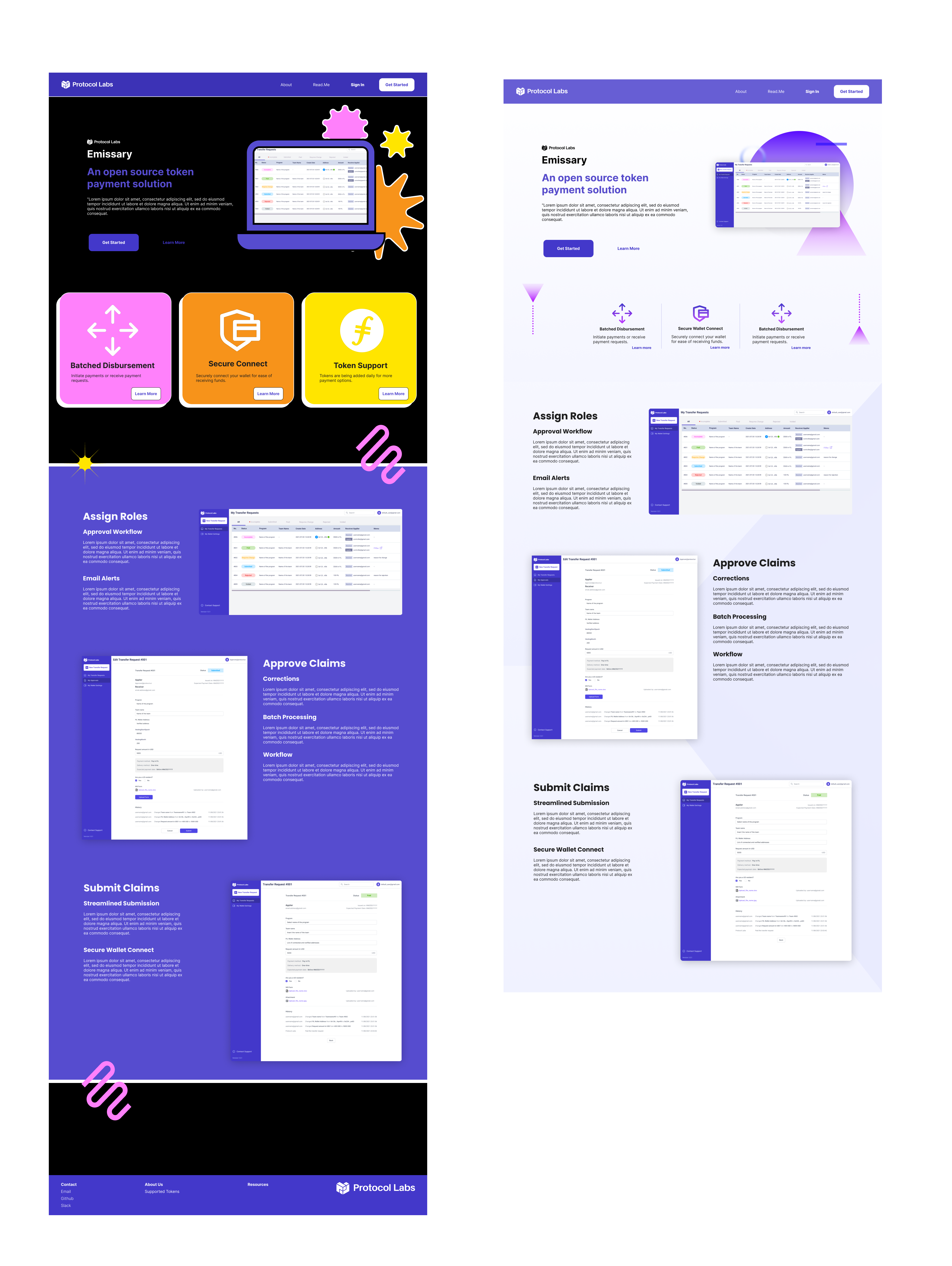
The final design comprised a landing page that successfully embodied the Web3 aesthetic, while offering functional ease-of-use. Clear and concise copy effectively conveyed the tool's core features. Carefully chosen color palettes and typography further enhanced the Web3 aesthetics, while subtle animations and interactions enriched user engagement.
The landing page effectively communicated the tool's functionality and received positive feedback from users and the finance team. The design became a template for other landing pages on the website, enabling various teams to utilize the service.
Designing Web3-inspired landing pages for cryptocurrency payments proved to be an exciting project, allowing me to experiment with new design trends and principles. The final design successfully conveyed the tool's functionality, while capturing visual appeal and brand consistency. The project's success is attributed to collaboration with the finance team, and I am grateful for the opportunity to create a solution that will benefit many users.
See the designs in Figma or embedded below.