Revamp of Filecoin's Build Website for Improved Usability
Filecoin.io

View Case Study

YEAR
ROLE
Company
Code Your Dreams is a non-profit bringing tech education to disadvantaged youth and at risk young adults in the Chicago Area through different targeted programs. To help train more prospective teachers, Bri and her team at CYD want to implement a Learning Management System where they can host training curriculum to help potential teachers and volunteers onboard themselves.
After discovering limited customization within the LMS that Code Your Dreams is implementing, I set up a kick-off call with Bri and her team to define our scope. Through this conversation, we learned that Code Your Dreams’ programs are expensive to run; teachers are salaried and resources are donation-based.
Considering the financial constraints, Bri wants to be a be able to expand the program’s reach through enabling the start of new chapters nation-wide. Chapters would be responsible for their own funding opportunities. While the LMS content would help volunteers onboard to the organization, a bigger problem was identified: the CYD site is not conducive to recruiting participants and lacks an entry point to chapter creation.
Code Your Dreams needs a streamlined way to share opportunities to start new CYD chapters because of financial, time, and resource constraints inherent in their single-chapter model.
Through the design of a clear mission statement, straightforward user flows, and refined content, Code Your Dreams will be able to attract and retain volunteers and new chapter creators in order to propagate the Code Your Dreams mission nationally.
We had three primary goals tied to our business problem that we used to inform our research.
1) First, a redesign of the code your dreams website in order to promote the nonprofit’s goals and growth.
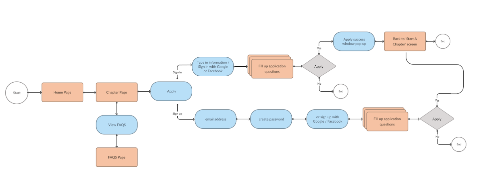
2) Next, adding a forum for users to find information and kick off the process to start their own Code Your Dreams chapters.
3) Finally, while we weren’t designing an LMS, we did want to create a seamless flow from the Code Your Dreams site to the LMS platform, Benchprep.
Through secondary research we learned a lot about nonprofit organizations, volunteer onboarding, and chapter creation. Regarding chapter creation, Code Your Dreams provided limited information surrounding their requirements requirements; I sought out information from nonprofit resources and other nonprofits’ processes to help guide our recommendations to Code Your Dreams. We discovered some core needs, ranging from legal and tax implications to standard operating questions.
All findings were provided to the organization in a research report with a recommendation for the organization to align on requirements prior to launching the updated site.
We asked eight participants about prior volunteer experience, identifying "good" nonprofits, and onboarding to new organizations. Participants included:
Through user testing, we asked one of two prompts based on the participant's background (as categorized above) around navigating the site and signing up to volunteer. All participants were deterred by the lack of program details, like cost and requirements. Additionally, in all of our tests participants commented on the mission statement being vague. In the end, we concluded our usability tests and interviews with some important takeaways:
.png)
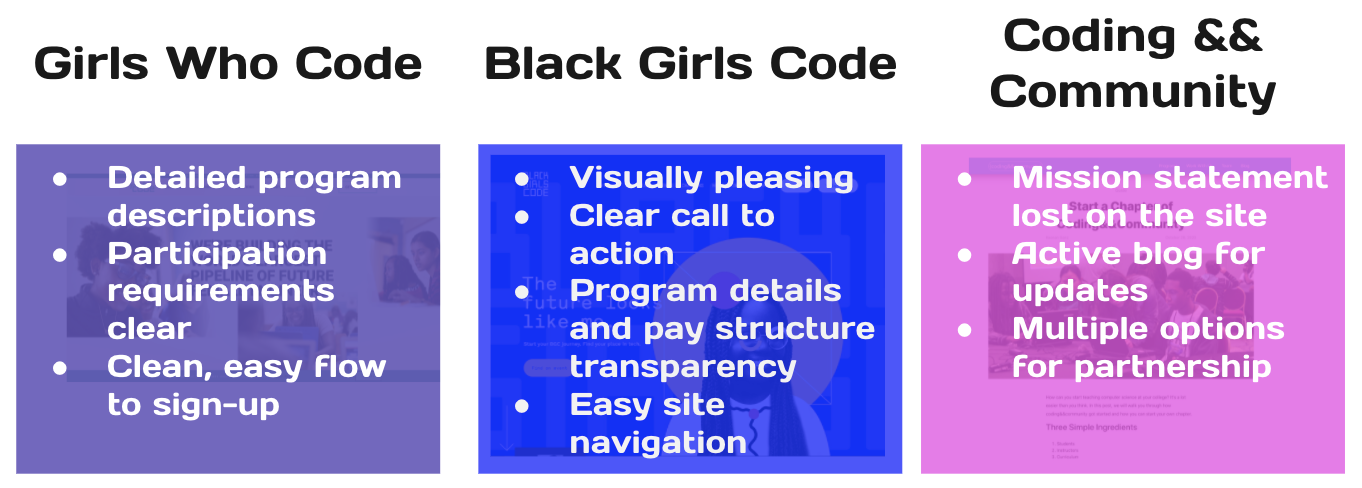
Our team looked at a handful of great organizations with similar missions of empowering communities through tech education. We found solid user flows and clearly defined programs as well as some puzzling mission statements. Looking at other organization's sites gave us some great ideas and new opportunities for the Code Your Dreams design.
.png)
.png)
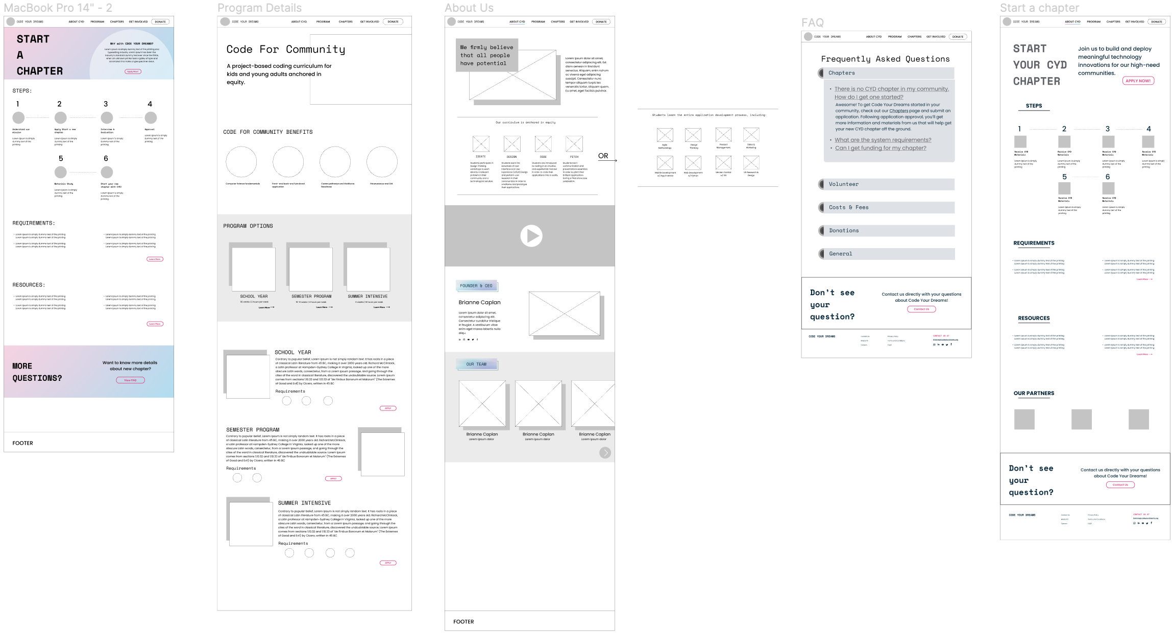
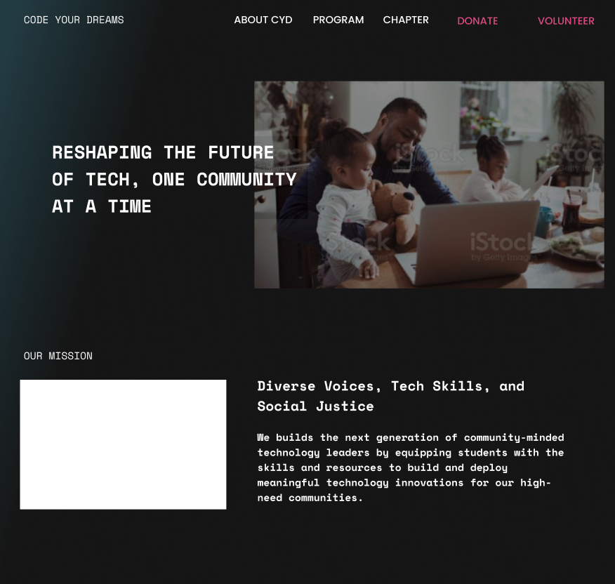
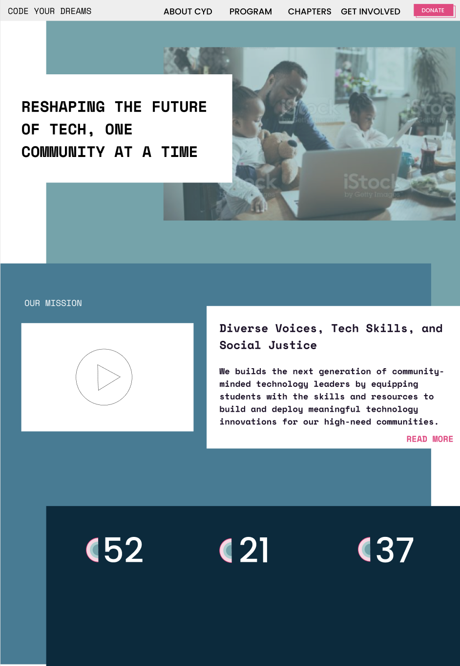
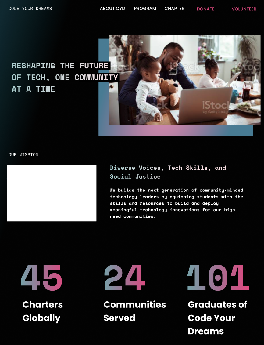
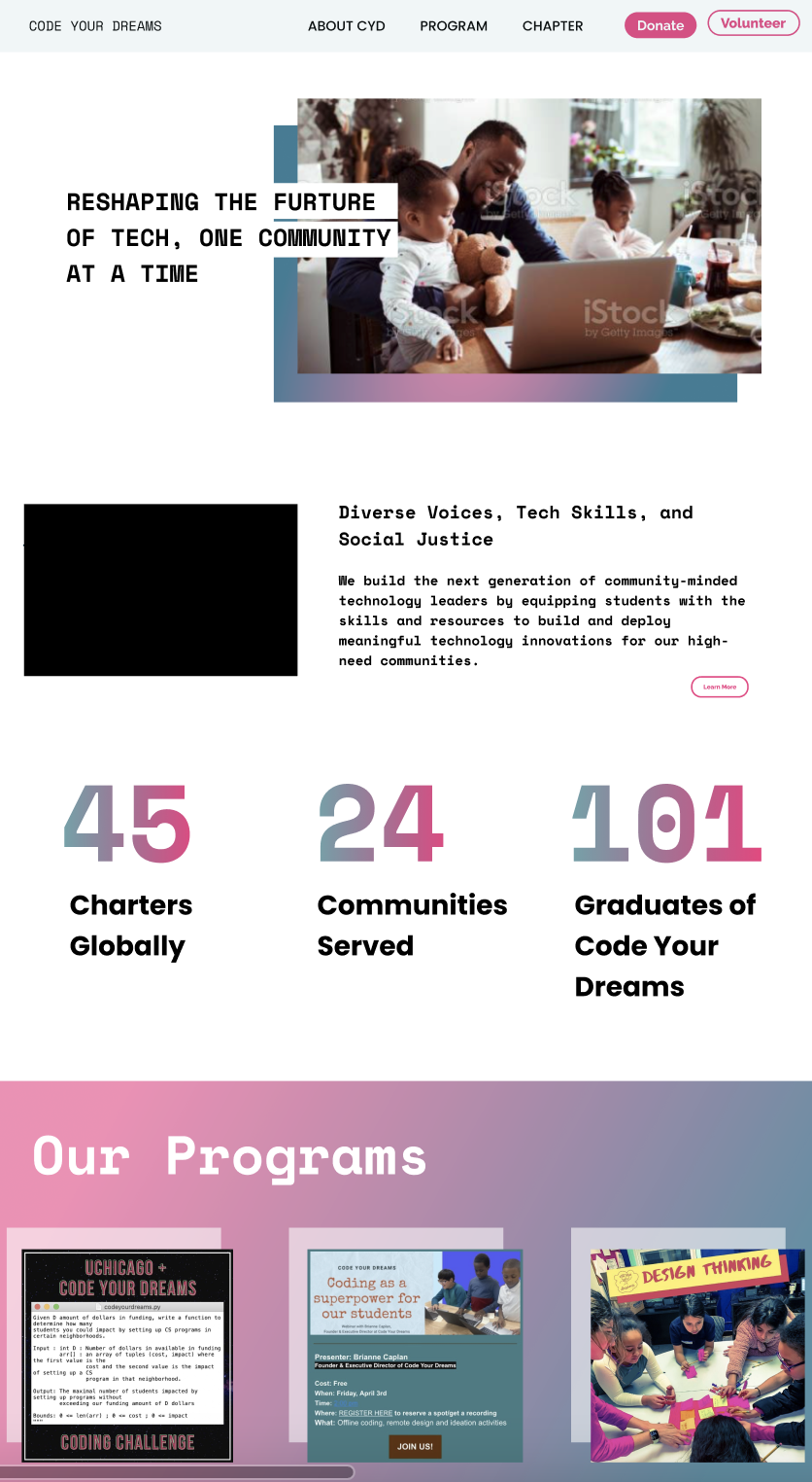
With our general structure set, I created four versions of the homepage to determine the direction of the rest of our site. 3/4 participants preferred a white background (fourth image) to the impersonal-feeling “dark mode” homepage (first and third images) or the more dated-feeling color blocked homepage (second image).
My team iterated on this design and carried this look throughout the entire site.
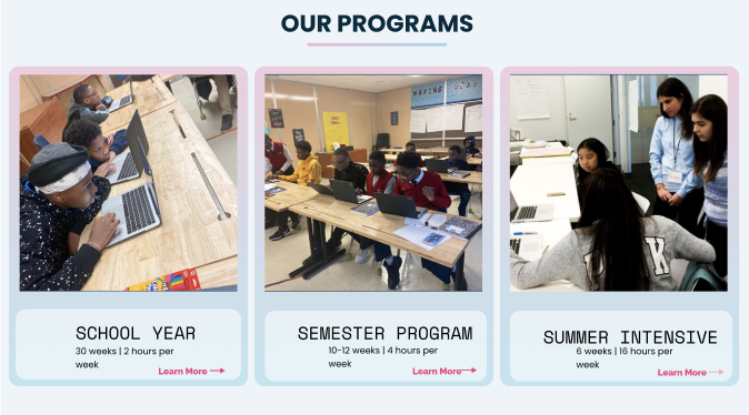
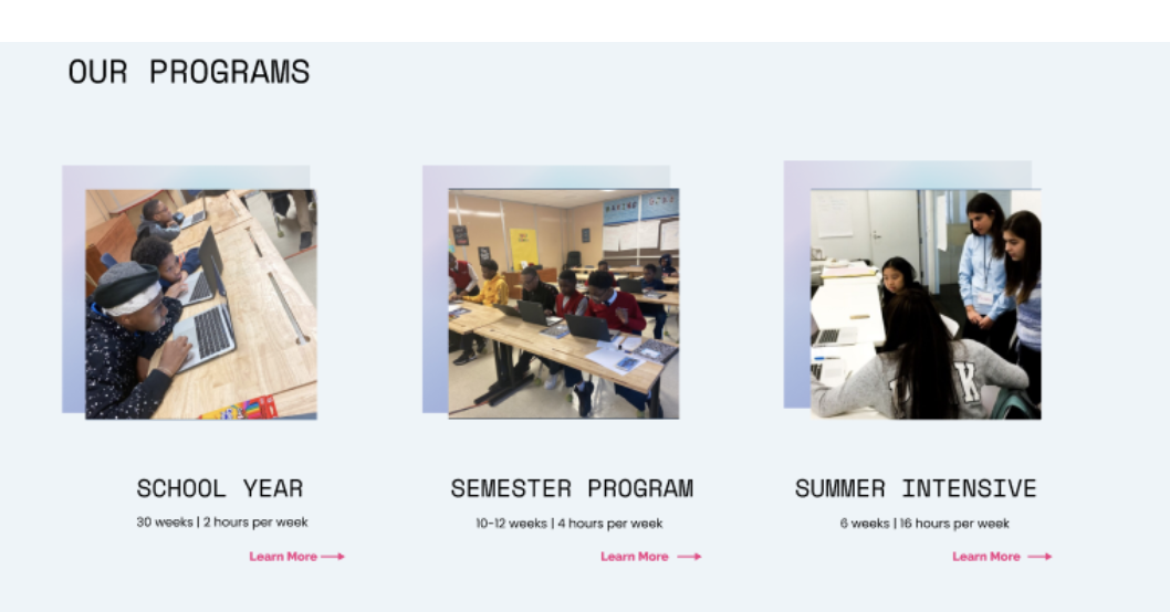
On the program details page, I conducted similar testing for the program cards, where participants preferred the program cards below...
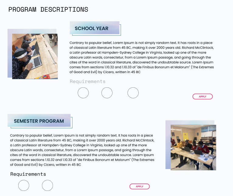
And program details, where participants preferred the program detail layout on the left citing ease of scanning program requirements.

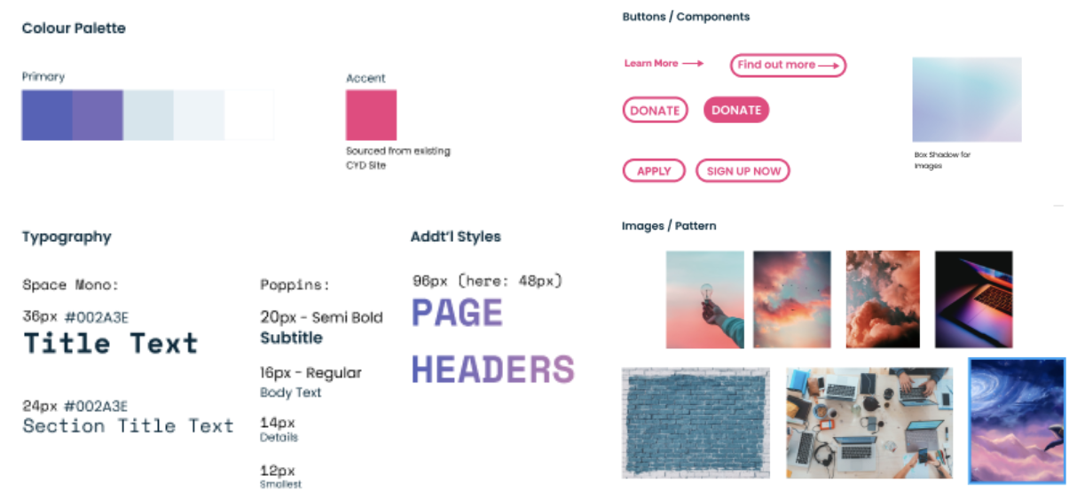
Without a design / style guide and limited direction, we wanted to update the color palette while adhering to the original intent. So, we created a technical dreamscape: pinks purples and blues that feel cohesive and fresh.
Try our prototype out for yourself (try joining as a volunteer or making a donation), below orhere.
Also, view the current, not-yet-updated Code Your Dreams site to compare designs and learn more about this amazing organization here.
• Hand off design file and research summary to developers ✅
• Iterate based on developer feedback ✅
• Reach alignment on chapter creation process to inform content (!)
• Launch the new design in Squarespace (!)
• Conduct more usability testing in live site (!)