Revamp of Filecoin's Build Website for Improved Usability
Filecoin.io

View Case Study

YEAR
ROLE
Company
ClassFindr is an edTech startup aiming to connect students seeking credits outside of their home institutions with empty seats. In this design sprint, I worked with two other UX Designers to solve for ClassFindr’s unique design problems.
3 week design sprint
Figma, Miro, Google Workspace, Slack, Zoom, Calendly
User Interviews, User Surveys, Heuristic Analysis, Moscow Method, Design Studios, Wireframing, Prototyping, Gantt Chart

College students need a streamlined way to access, compare, and register for course alternatives because of a lack of guarantee that the courses they need or want to take are available at their home institutions.
Through the design of a clean user interface, extensive search functionality, and a comprehensive dashboard, ClassFinder will be able to offer students and higher education administrators a streamlined way to access exactly what they need. Additionally, developing in-app messaging reduces the need of students and administrators to toggle between screens and further optimizes the ClassFindr platform.
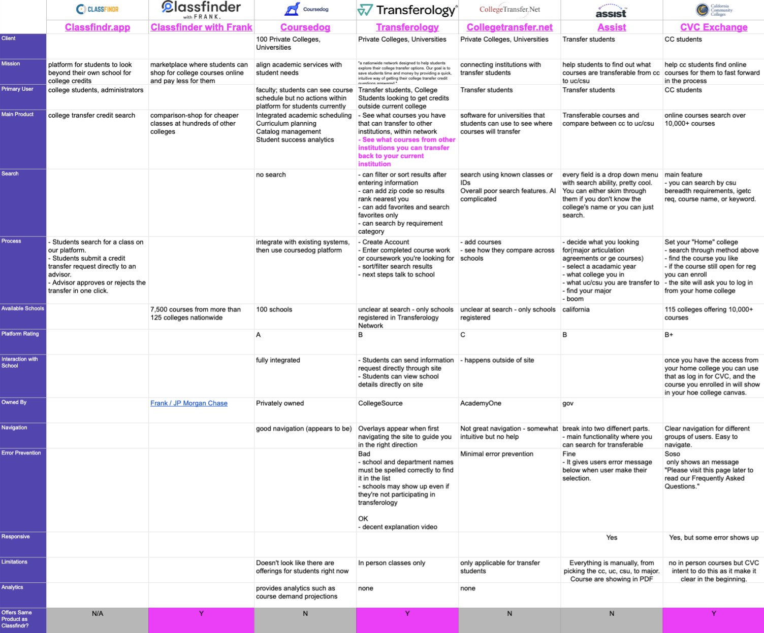
After a deep-dive of the ClassFindr site, we performed a competitive analysis, comparing 16 different criteria against six college credit transfer networks/apps: Classfinder with Frank, Coursedog, Transferology, Collegetransfer.net, Assist, CVC Exchange.
In comparing these criteria— which included client, mission, user flows, navigation, limitations, and more— we determined several opportunities for ClassFindr to differentiate itself from others in the space:
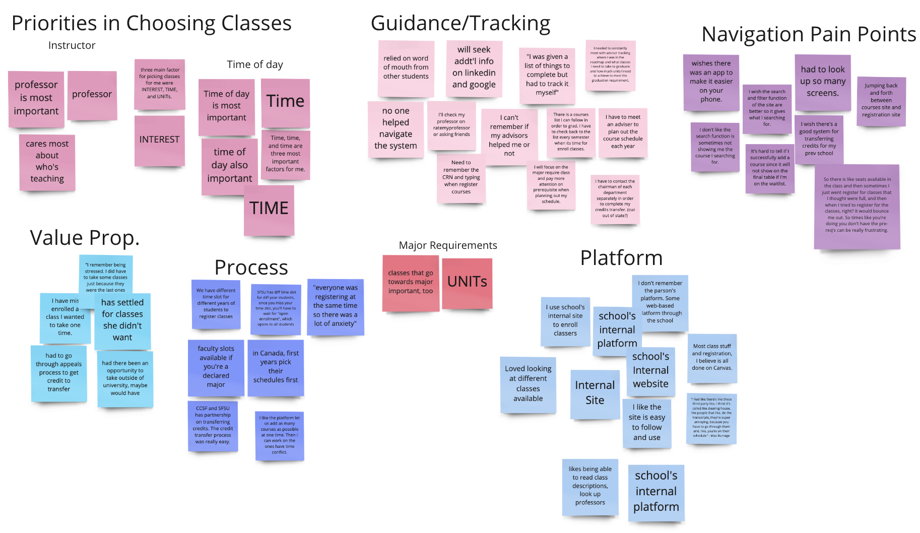
After sending out a screener survey and receiving 75 responses, I spoke with four of our group's 10 total interviewees, comprised of students and recent grads, to understand what they look for in the college registration process.
What we found challenged some assumptions (students' number one priority was schedule fit, not content) and reaffirmed others (the current course credit registration process is overwhelming and inefficient).
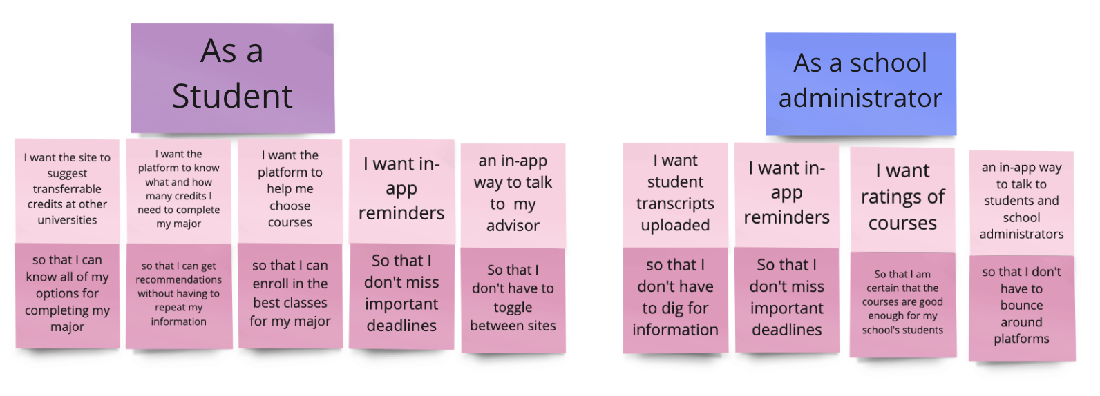
Through our research, we landed on nine essential user stories we relied on to inform our design. It was critical that we incorporate these into our user flows in the final prototype.
Combined with our interview data, these user stories formed two unique personas: The Student and The Registrar.
The Registrar
College administrators want to help students graduate on time but also need to fill seats at their home institutions. They are looking for a system that is easy to navigate, offers quick execution, and won't require screen toggling.
The Student
Students are overwhelmed by the mental gymnastics required to finding courses that fit their needs during the course registration process, and the registration platforms are exacerbating the problem. They wish there were more courses available within their fields of study to ensure on-time graduation.
Students are frustrated by the mental gymnastics required to determine which classes are 1) available 2) fit into their schedules 3) fit their preferences.
No platform currently exists that allows students to find all of the information they need within the same app. Students want to be able to complete tasks and workflows within the same window, or at the very least within the same app.
Students would like to track their data in one place and have a smart way to see if they're making smart choices for credit requirements.
Many students we spoke to were frustrated at the lack of feedback during the course scheduling process. They expressed their disappointment with the existing platforms, which also fell short in providing a streamlined approach to facilitating communication between the school and the students.
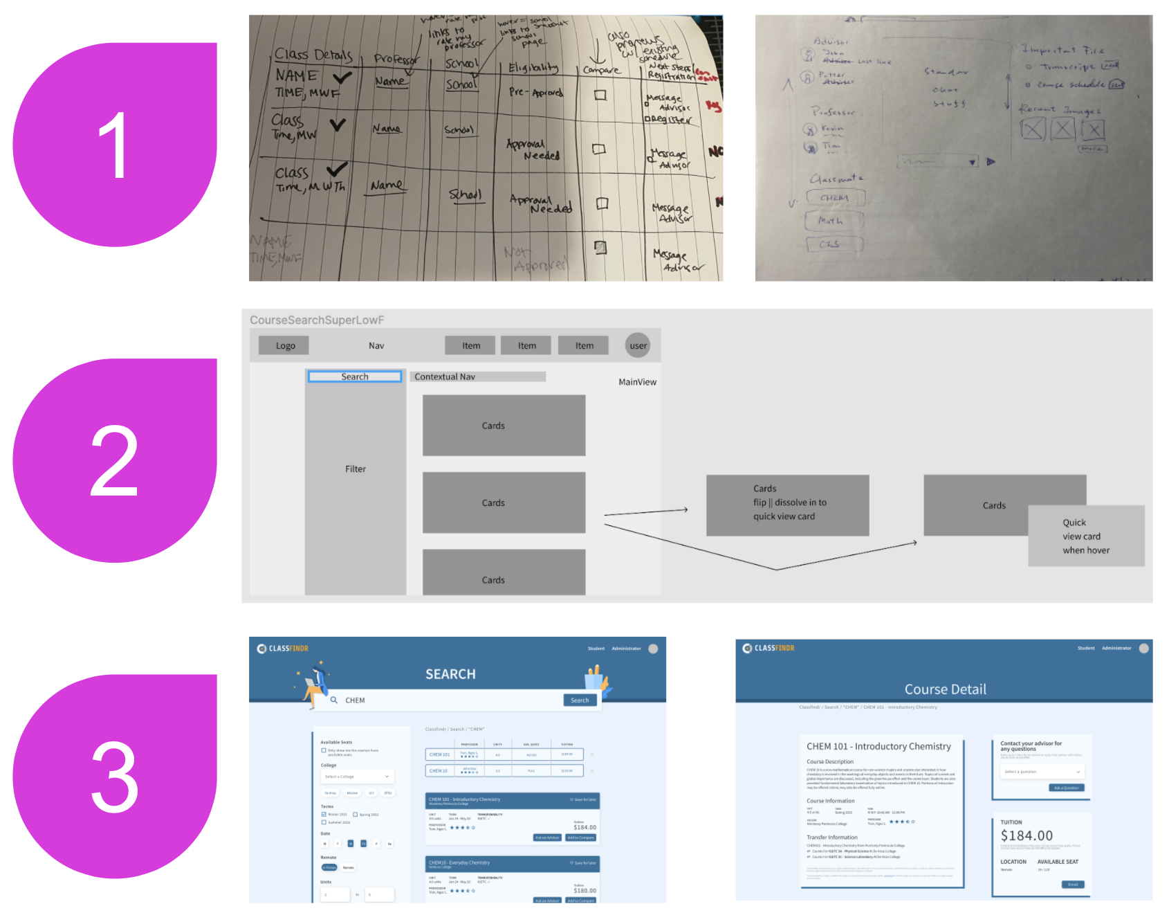
Our team ran several rounds of design studios to capture our visions of user onboarding, messaging, search, and the user dashboard. This allowed us to Frankenstein our way to a design that captured the best of each.
Below, you can see our designs for the search function, from initial sketch to wireframe to mid-fidelity prototype.
While the process you see is sequenced 1, 2, & 3, in reality the design process is iterative. From stage 3 we jumped back to 1, to 2, to 3 again, to 2, to 1, to 3, etc etc.
After landing on a V1 prototype, we conducted seven moderated user tests, asking each participant to complete six tasks within the prototype and following up with a series of investigative questions around their experience.
As a result, we made changes to the overall UI— like changing the background color and shadowing to make the course detail cards more legible— as well as to the user flows— like adding a back button for easier navigation and linking to a professor rating site to address another registration requirement.
I took a lead on designing a "smart scheduler" schedule preview that would allow students to find everything they needed on a single course detail page, pre-registration.


My primary contributions to the prototype were the search design, the homepage (which prominently features a search as an immediate call to action for potential new users), key features on the web messaging, and the user dashboard.
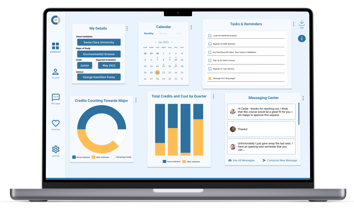
I designed a straightforward and customizable user dashboard that would enable to students and administrators to track their courses, schedules, tasks, and savings, as well as access in-app messaging for seamless credit sign-ups and approvals.
The dashboard is the "hub" of ClassFindr. It eradicates the need for multiple tabs and windows by harboring all information in one place and empowers students to take control of their credits.
Try our final mid-fidelity prototype out for yourself, below or here.
Research and Iteration
• Conduct more user interviews and user tests, with a focus on Registrars/College Administrators' user flows
• Explore mobile (this was de-prioritized during the sprint in order to focus on web after survey results showed students were most likely to register for classes from their laptops)
Seek out Partnerships
• Seek out partnerships with colleges and universities to ensure PMF
Explore Integrations
• Determine feasibility of integration